TradeLean Top-Down Analysis Strategy
In this post, we will share with you the most effective method of combining multiple time frames for an informed and accurate chart analysis.
— Andrey
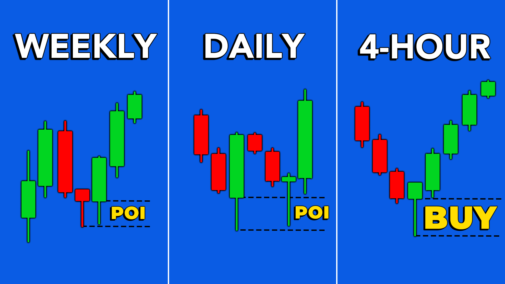
Introduction
In this post, we will share with you the most effective method of combining multiple time frames for an informed and accurate chart analysis.
By integrating Price Action with TradeLean Strategy, we’ll show you how to conduct a comprehensive top-down analysis.
Using this analysis, you will be able to identify market direction, Points of Interest (POI) and trading opportunities, by assessing both higher and lower time frames.
If this sounds like something you'd be interested in, make sure to sign up at tradelean.com.
What is Top-Down Analysis?
Top-down Analysis refers to a method that combines multiple time frame analysis along with key market factors to form a thorough understanding of market conditions.
Starting from higher time frames and gradually zooming in allows us to gain a broad view of the market direction and important levels and zones in various timeframes.
Many beginner traders tend to overwhelm their charts by starting with the monthly time frame.
By the time they complete the 15-minute analysis, the chart becomes cluttered and messy, making it difficult to understand what’s happening.
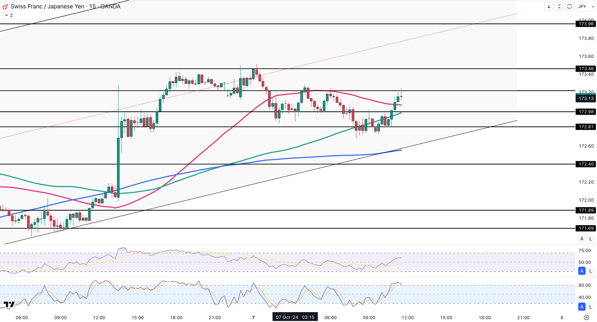
At TradeLean, we focus on simplicity and what truly matters.
In this post, I’m going to show you exactly what to focus on for each time frame so you can efficiently analyse any chart in any market.
Combining Multiple Timeframes
But first, why is it necessary to combine multiple time frames in your analysis?
Let me give you the top three reasons:
- Resolving Directional Confusion
On this 4-Hour EURUSD chart, the market appears indecisive with no clear trend.
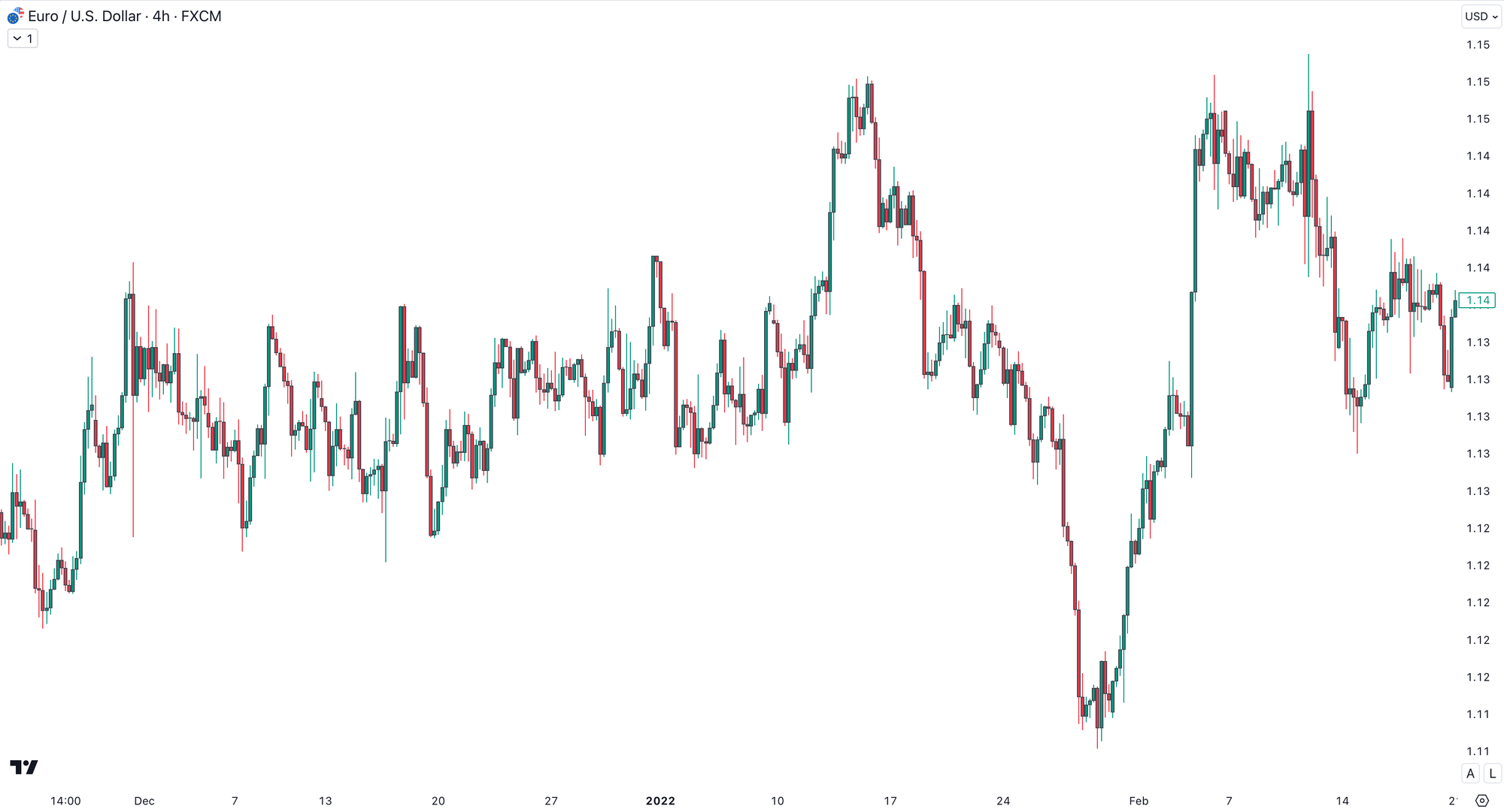
It constantly breaks through structure on both sides, making it hard for a trader to determine the trend.
But if we zoom out to the higher time frame, daily chart, the market trend and bearish momentum become immediately visible.
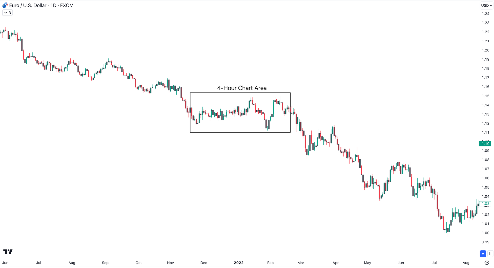
The highlighted area matches the one we were examining on the lower timeframe.
Once you understand the larger time frame bias, you can confidently take trade in the right direction on the lower time frame.
Whenever you’re confused about market direction and structure keeps breaking down, it's a sign you're analysing the wrong time frame.
By zooming out to a higher time frame view, you can improve your precision and confidence in making trade decisions.
- Boosting Accuracy
A price action in the lower timeframe with a price level or zone that is significant in the higher time frame can result in a major trend reversal.
Before placing any trade, it’s essential to know how much room you have before price hits a higher time frame price level or zone.
This helps to better plan your targets, stop-losses, and avoid unnecessary losses.
Take a look at this CHFJPY Daily Chart.
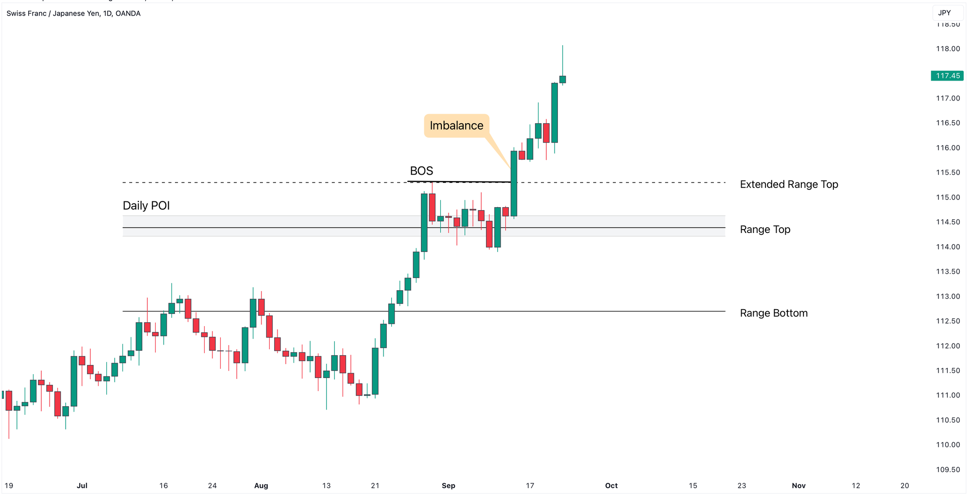
We saw a strong upward movement with a clear Price Imbalance, created by bullish Momentum candle, printing the Break of Structure (BOS).
The preceding candle that created this inefficient move is the bearish candle that corresponds with the zone around TardeLean Range Top level.
Therefore, it becomes a valid entry zone, highlighted as a Daily Point of Interest (Daily POI), and a great opportunity to go long.
But then the market broke through this zone.
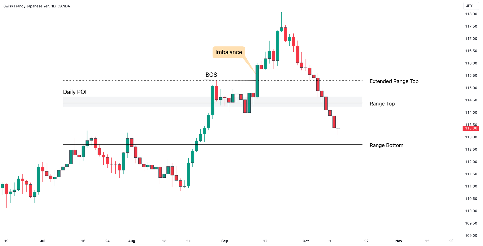
Why did it happen?
When we zoom out to a higher time frame - the Weekly Chart, it becomes apparent that price hit a significant resistance level from the higher time frame, which led to the market reversal.
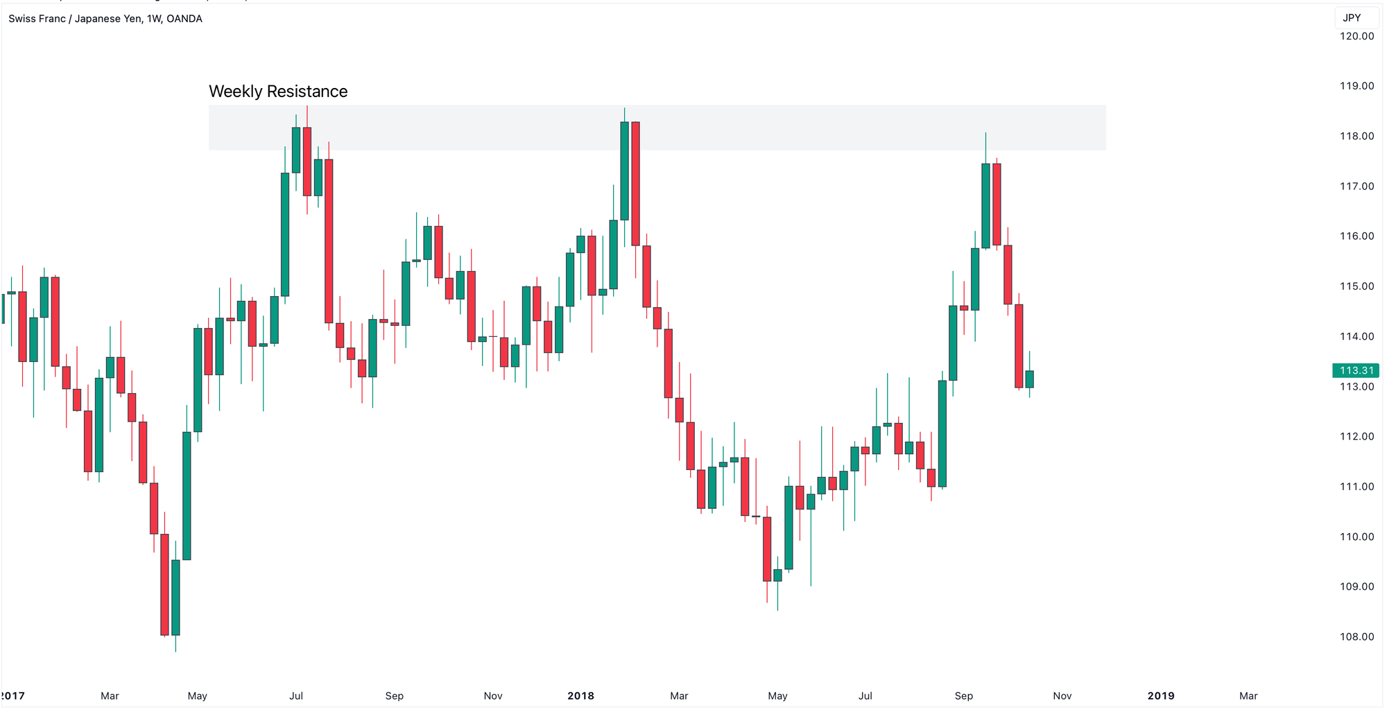
Identifying this higher time frame zone would have helped us avoid this risk.
Considering another example:
On the lower time frame, EURNZD Daily Chart, we see an inefficient price moves creating Price Imbalances, a Change of Character (CHOCH) and a Break of Structure (BOS).
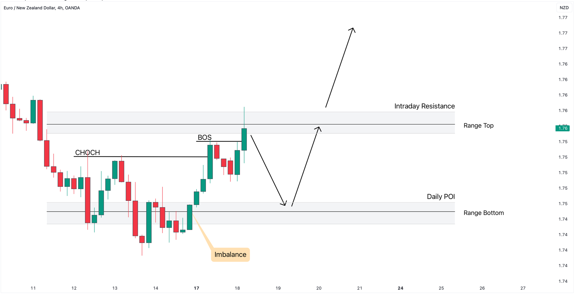
If price retraces back to Daily POI it could be a perfect opportunity to go long, setting our stop below the swing low and aiming for the next structure price level.
Now, what about the higher time frame?
On the daily chart, we see the important resistance level.
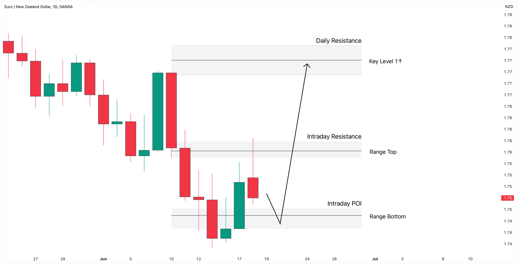
There’s still plenty of room for price to rise before hitting this resistance, making this a great potential trade.
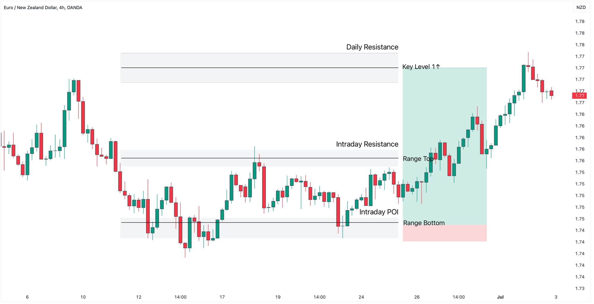
As price returned to the Range Bottom zone, we saw a formation of the Long-Legged Doji, followed by price reversal.
This is the advantage of combining higher and lower time frames for better trade setups.
- Calibrating Trade Entries
Using multiple time frames allows traders to find ideal price spots to enter and exit trades.
For instance, imagine waiting for price to pull back to a specific POI and open a buy trade in line with the bullish trend.
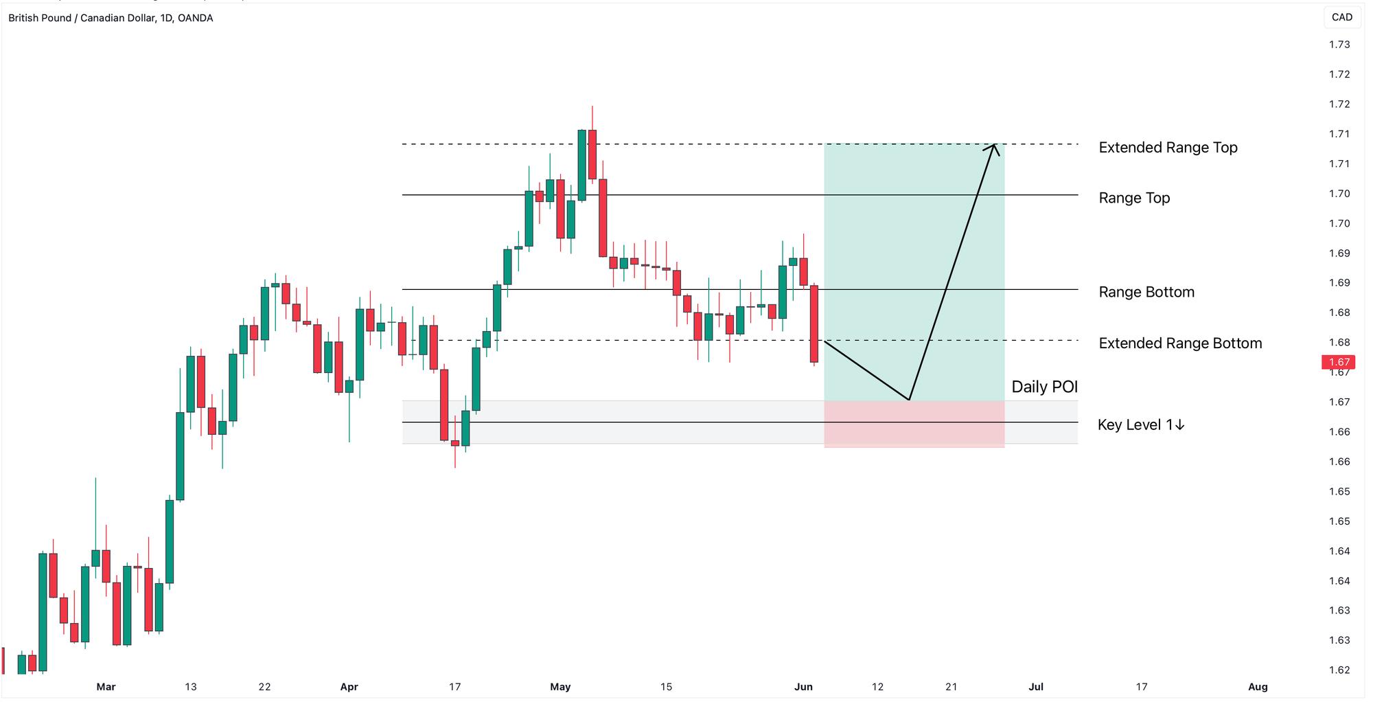
If you place the buy order at the beginning of the zone, your stop loss may end up being too wide.
A better approach is to look for confirmation on a lower time frame to enter at a more favourable price maximising Risk-Reward Ratio.
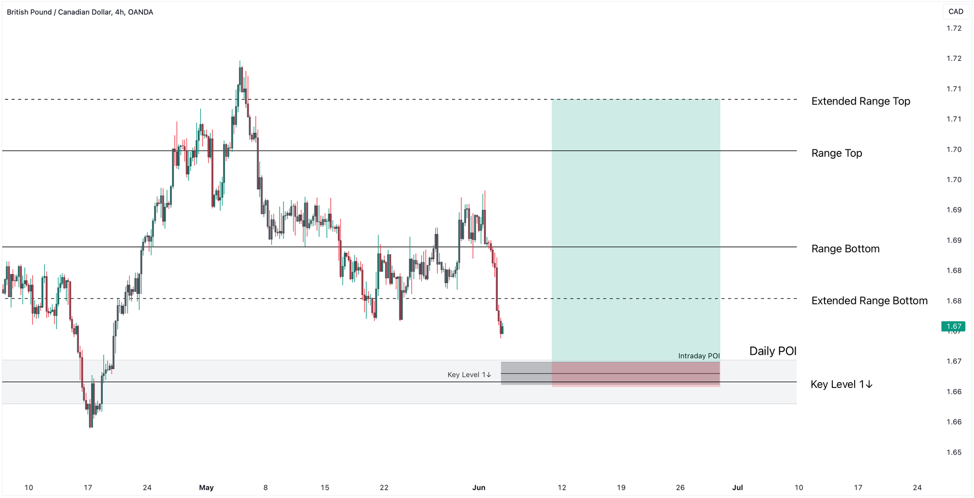
This not only gives you a better entry but also filters out false signals and boosts your confidence in the trade setup.
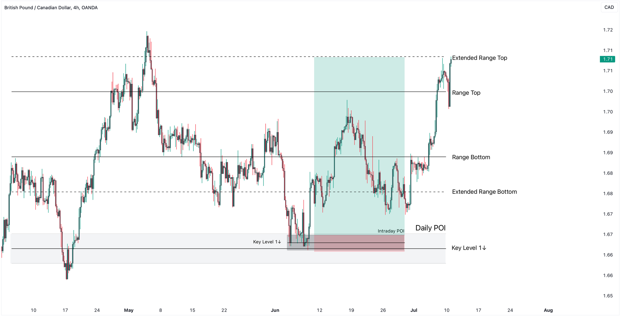
Now that we've covered why multi-timeframe analysis is so important, let’s dive into the step-by-step process to combine multiple time frames for clearer chart analysis.
But before we proceed, if you're enjoying the content, don’t forget to share this post and leave your questions in the comments section below.
Let’s get into our methods!
TradeLean Top-Down Analysis
TradeLean Top-Down Analysis follows a systematic approach, starting from higher time frames and narrowing down to identify the best trading opportunities.
We consider three time frames.
First, we have the weekly time frame, which we use to pinpoint major key weekly levels and zones.
Next, with the daily time frame focus is on additional important daily levels and zones.
Next, the 4-Hour time frame is where we do the bulk of our analysis, highlighting intraday levels and zone, watching price action and identifying trade setups.
The 4-Hour Chart is used to trigger the trade.
While it is not required, you can also seek confirmation and calibrate entry points based on 1-Hour and lower time frames.
TradeLean Top-Down Analysis Example
Now let’s apply this method to some real charts so you can see how it works in action.
EURUSD Example
EURUSD Weekly Chart
Here’s the EUR/USD pair on the Weekly Chart.
The pair has printed a higher high, and a higher low is currently in the making, indicating a bullish structure.
Step one is marking the important levels that price has reacted to.
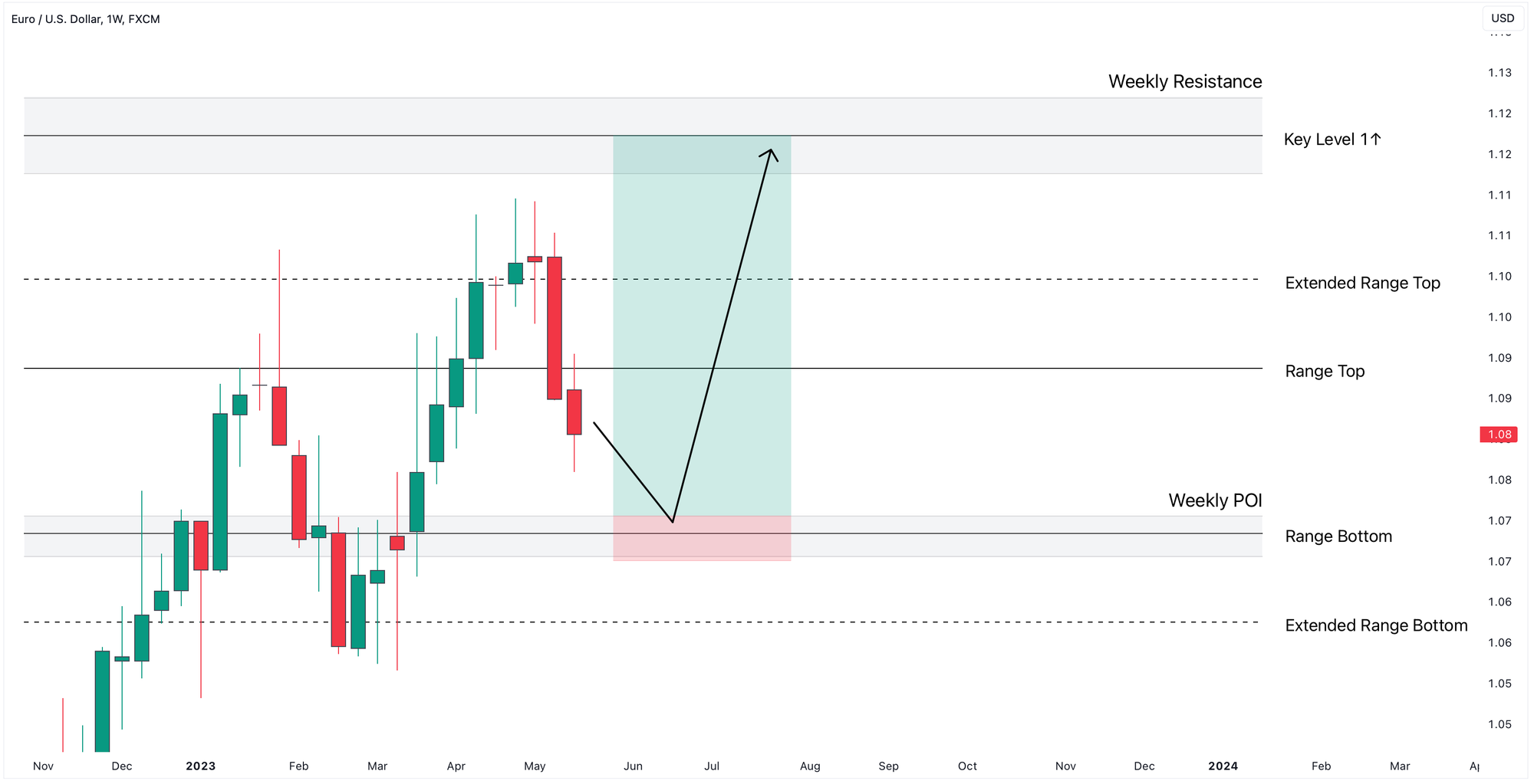
We aim to keep things simple by drawing only the most relevant structural levels.
Here, TradeLean Indicator helps us to identify the most important price levels and zones.
Since EURUSD dipped into the Range Zone and confirmed Range Top as a Resistance, it is very likely that the price will move towards Range Bottom.
Considering the significance of the Range Bottom level on the Weekly Chart, our hypothesis is that EURUSD will likely form a lower low in that area.
We will refer to that area as Weekly Point of Interest (Weekly POI).
TradeLean Key Level 1↑ acts as the most significant resistance level in the Weekly Chart and is considered the ideal target.
Range Top and Extended Range Top will act as the intermediate Take Profit targets.
That’s all we need from the weekly time frame—just the major levels that are likely to prompt a reaction when price taps into them.
EURUSD Daily Chart
Now, let’s move down to the Daily Chart.
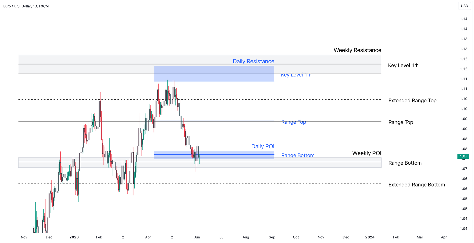
We begin by marking the daily key levels and zones in a different color (blue) to differentiate them from the weekly levels.
This distinction is important, especially when analyzing lower time frames, as higher time frame levels carry more significance.
On the Daily Chart, our first step is to look for confluences between daily and weekly levels, which we highlight.
These confluences are highly significant.
In this case, there is a clear alignment between the Weekly and Daily Points of Interest (POI) corresponding to Range Bottom levels in the Weekly and Daily Charts.
In addition, we see a confluence between the Daily and Weekly Resistance Levels, corresponding to TradeLean Key Levels 1↑.
Additionally, we observe that the price has already dipped into the overlapping Weekly and Daily POIs and is now attempting to form a base for a potential reversal.
A strong bullish Engulfing candle formed from the Weekly and Daily POI area, although the price later retraced into the same zone.
This distinction between daily and weekly levels remains crucial as we move to lower time frames, where the weight of higher time frame levels becomes even more significant.
With that, we have all the information we need from the daily chart.
Identifying Significant Structural Price Levels
If you are not using our TradeLean Indicator to identifying critical price levels or zones, keep in mind three key tips when marking those levels:
- Treat levels as zones rather than precise lines.
- Mark the levels with the highest number of touches.
- Prioritise levels from the candle bodies over wicks.
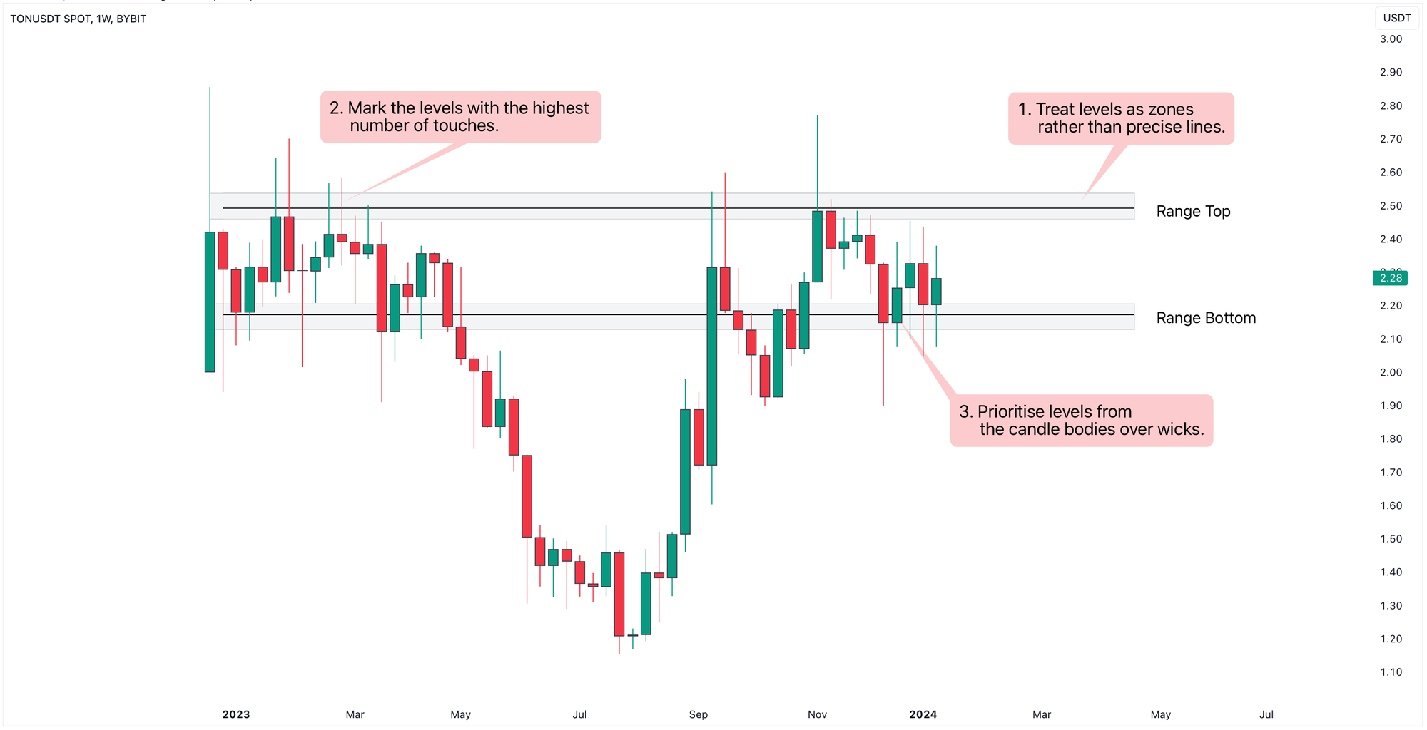
Additionally, there are several factors that enhance the strength of a key level or zone.
In TradeLean, we refer to those levels and zones as important or key: (Extended) Range Bottom and Top, and Key Levels.
These are five factors:
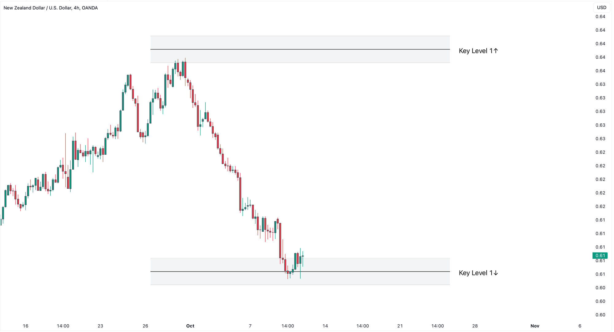
- Turning points are areas where the market previously reversed direction. When price approaches these areas again, there’s a higher chance it will react.
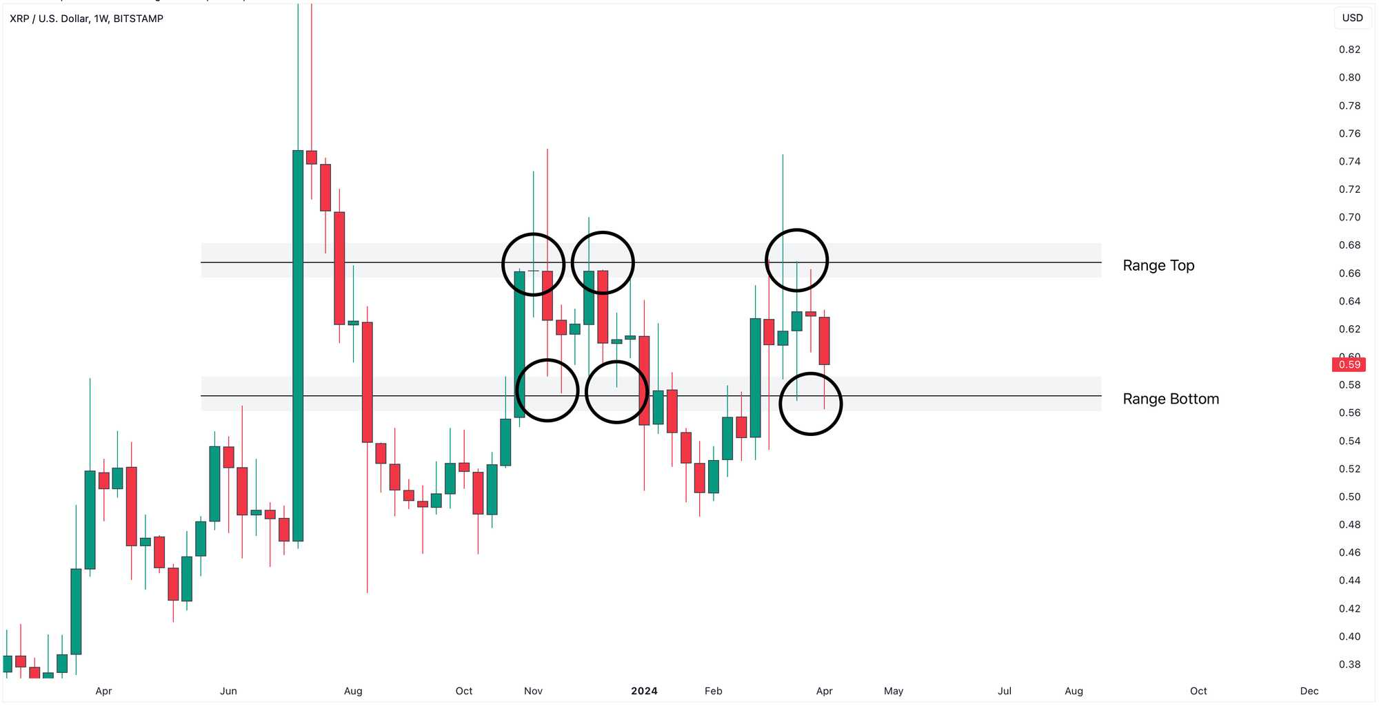
- If price has been rejected from an area several times, it indicates that traders are actively defending that level, making it stronger. More rejections don’t guarantee it will hold. However, if the rejections get weaker over time, the level is more likely to break.
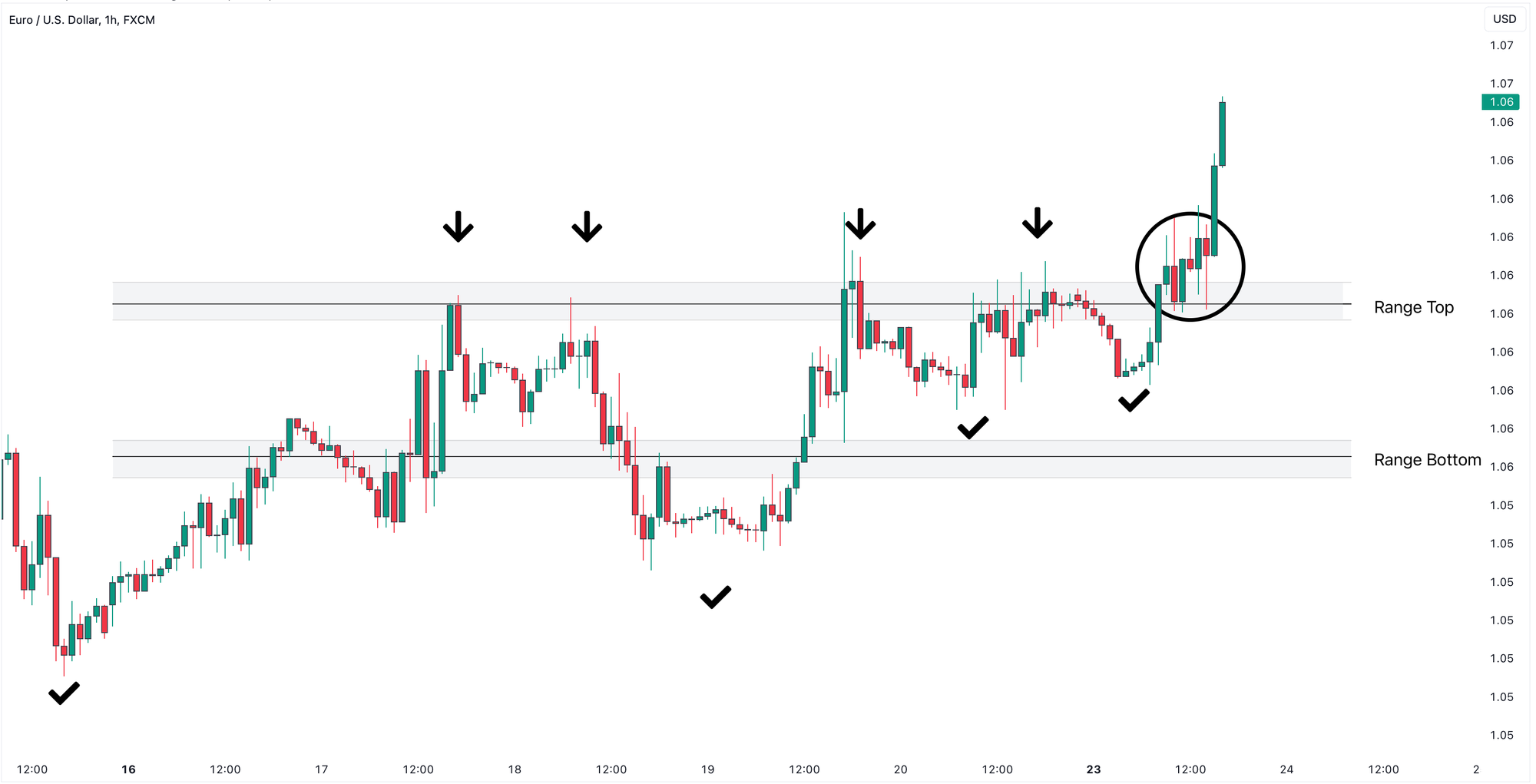
- When a level has alternated between support and resistance, it becomes more likely to reject this level again.
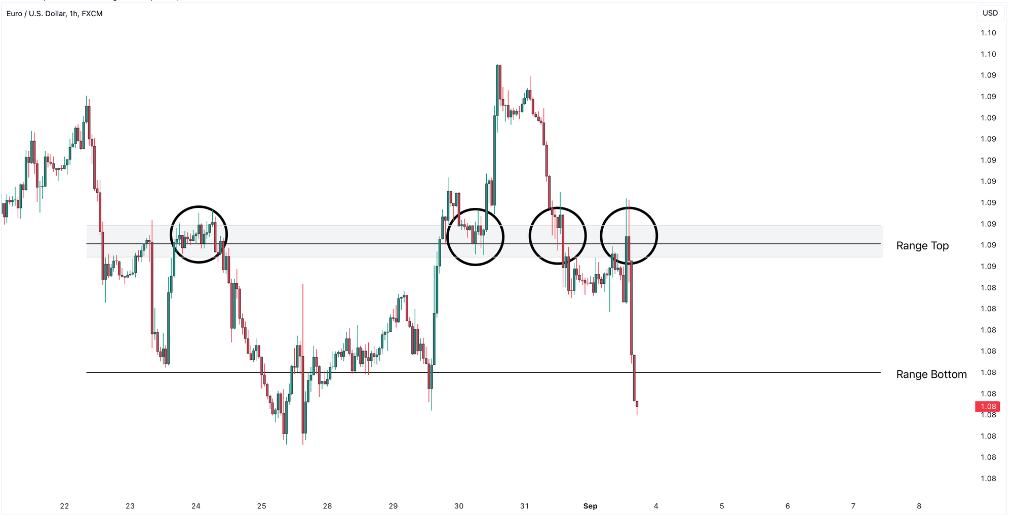
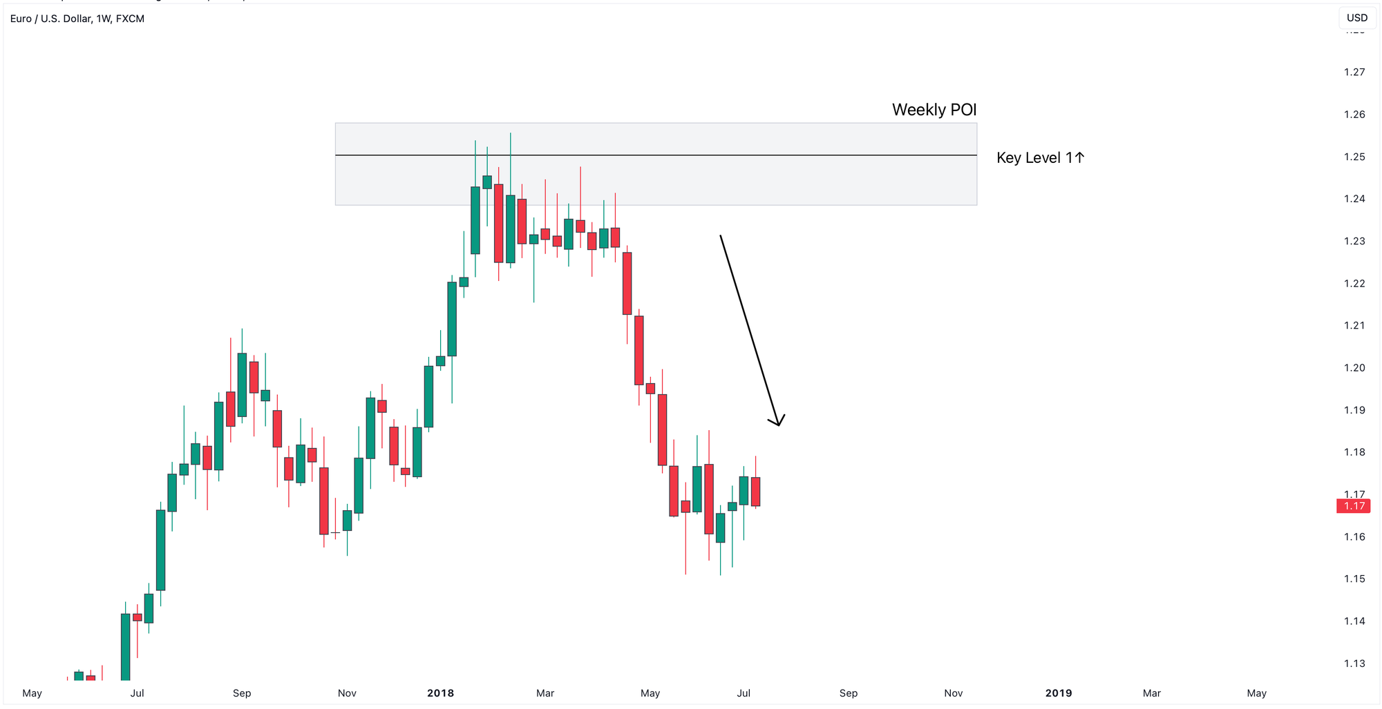
- The larger the move away from a level, the more significant that level is.
A drastic reversal adds more weight to the zone.
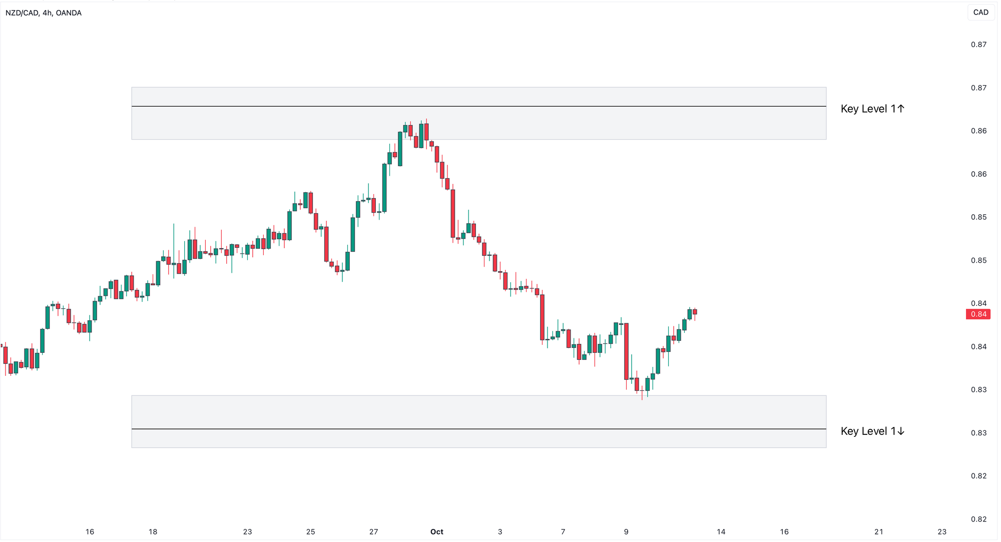
- More recent levels, whether they are support or resistance are typically more relevant than older ones.
EURUSD 4-Hour Chart
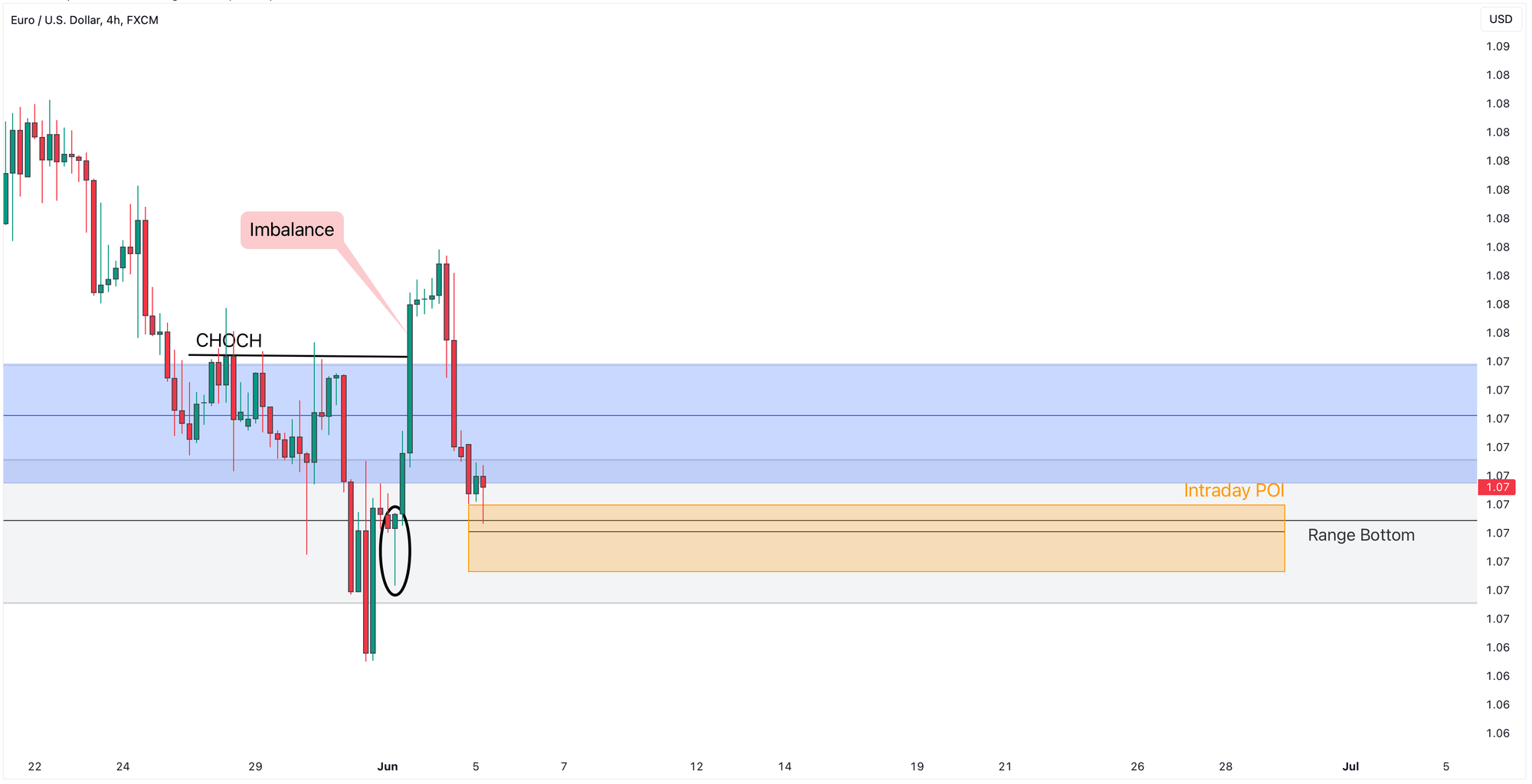
Now that we have these guidelines in place, let’s zoom into the 4-hour chart to continue our top-down TradeLean analysis.
On the 4-hour chart, you’ll see the price is trading in the weekly (grey) and daily (blue) zones.
We also add the Intraday POI (in yellow) which is the Range Bottom level in the 4-hour chart.
We use weekly and daily levels in two main ways:
First, breaking through one of these levels signals which side has taken control, with price potentially heading toward the next level or zone.
Second, as discussed above, they serve as targets for our trades.
Continuing with 4-hour time frame, we identify market structure, price imbalances, liquidity zones and trade entry opportunities.
We see that the price recently broke out of the weekly (grey) and daily (blue) POIs with strong momentum, indicating that buyers are trying to take control.
There’s an inefficient move created by the daily bullish Engulfing candle (see above) that left an Imbalance and printed a Change of Character (CHOCH).
To close the Price Imbalance, it retraced back in the weekly POI and daily POI areas and is trying to create a base for a lower low, presumably in intraday POI or Range Bottom zone in the 4-hour chart.
The candle that caused the inefficiency by the most recent bullish move (in black eclipse) offers additional confluence with the intraday POI and becomes our entry area offering a long trade opportunity with Stop Loss a few pips below Intraday POI area.
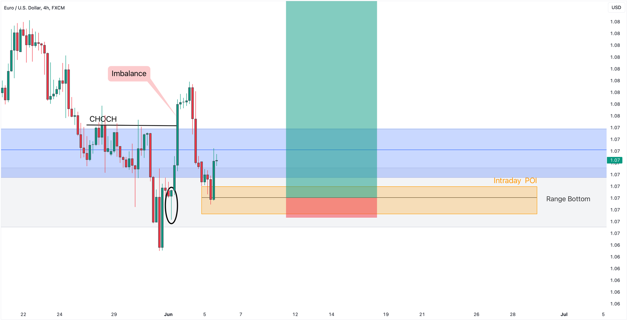
The price dipped into the Intraday POI and with the long trade triggered, the price started grinding up.
After confirming the bullish structure, price re-tested the top of the Daily POI area confirming it as a support and continued further upward.
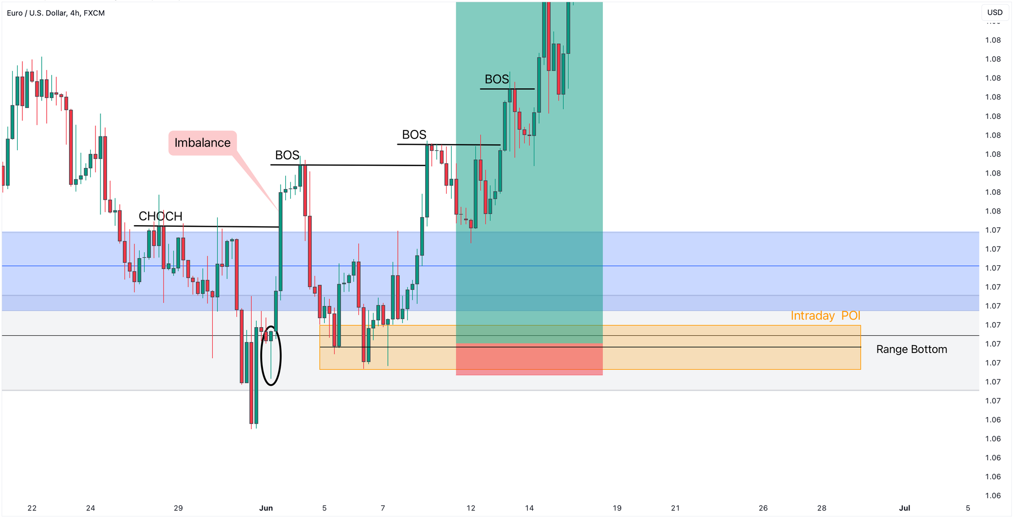
Subsequently, we saw a formation of a series of higher highs and higher lows.
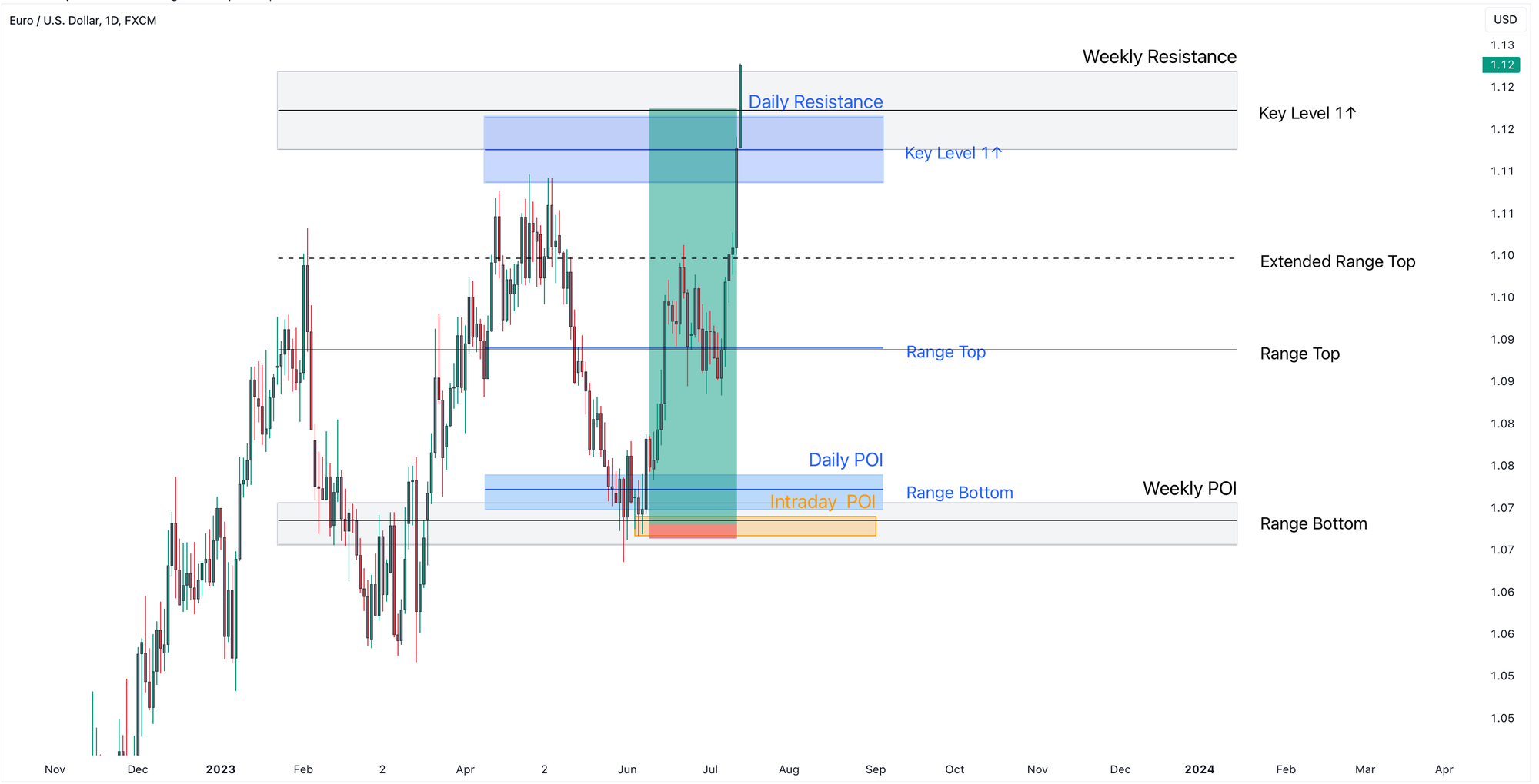
The bullish market structure then led to a strong upward move towards the Weekly Resistance target.
Closing
Remember, before applying any trading strategy to your real account, you should backtest it using historical data on different pairs and timeframes to evaluate its performance.
I hope you’ve found this post valuable.
If you have, please share it to show your support and subscribe if you're new.
And don’t forget to leave your thoughts and questions in the comments, as we always try to respond to everyone.
Happy Trading!